(Yes, and why we prefer scanning over reading may surprise you.)
Scanning; we all do it, especially when scrolling through social media or skimming through a post. We visually bounce from word to word to understand the ‘gist’ of what’s being conveyed.
Scanning involves the internal recognition of letters and words, and it identifies patterns of text. So, it is not necessarily about comprehension (though that does happen).
It closely mimics a user’s natural reading speed for personal consumption, which is important to note. However, reading speed is reduced when the user is asked to read the entire text and then reduced further when reading aloud.
Reading aloud is a less fluid process, as vocalising words lags behind the brain predicting what’s next and modifying what’s being spoken as a result.
Looking ahead can cause incorrect predictions, leading to some stumbling over words, especially for slow readers.
Interestingly, “If you watch a person’s eyes scanning text at a normal rate, the eyes seem to be ahead of the voice when we read aloud.”
Diving deeper into the science of scanning:
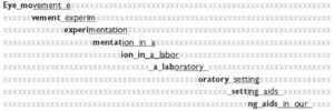
Rayner and Pollatsek, two researchers from the Massachusetts Institute of Technology, spent 20 years studying how the eye moves when reading. They discovered that it fixates on what they call content words, e.g., nouns and verbs in a quick succession of stops and jumps called fixation and saccades
A saccade “is a rapid, conjugate eye movement that shifts the center of gaze from one part of the visual field to another. Saccades are used for orienting gaze towards an object of interest. Saccades may be horizontal, vertical, or oblique.”
Imotions.com describe the fixation as “Between saccades, our eyes remain still for around 200-300 ms – this known as a fixation (“still” is a bit of a relative term here – our eyes often continue to move around as a result of optokinetic nystagmus, which aids visual processing in the brain).”

(Image from readingrockets.org )
Why do our eyes jump around like this?
Up-close we have a very narrow field of vision.
Try looking at both of someone’s eyes at the same time without flicking from one to the other. This narrow field makes us very sensitive to misalignment and being uncomfortable when wondering which of their eyes is looking at us.
Even when reading, our eyes move around to take in a larger view.
If you can scan quickly and easily, your eyes are not only seeing the text easily, but you are interpreting the text efficiently and with a degree of visual comfort.
Reading, on the other hand, is comprehending the words.
If it’s silent reading, it can include creating visual images to help understand the words, and we can often ‘hear’ the word in our heads. So, for example, when you read a novel, you’ll imagine the characters in your mind; you might even imagine how their voices sound.
Reading, primarily when out loud, engages the brain and the vocal system and, to a degree, comprehension.
However, with reading out loud before reading silently, there is a difference in understanding, with a greater degree of comprehension gained from silent reading first.
Ok, so why are we telling you all this?
When our software is choosing the individualised contrast colour background to text for your digital display screen, we are looking at set data to find the “one” most visually comfortable or accessible colour contrast for you.
One that aids in your scanning and reading.
The correct colour contrast does this by helping sustain the synchronicity of both eyes, mitigating binocular discomfort and loss of stereoscopic vision due to eye muscle fatigue.
It’s a fatigue that presents as early-onset blurred or double vision.

Here’s (very simply) how it works:
There are two primary types of photoreceptors in the human retina – rods and cones.
Rods are responsible for vision at low light levels (scotopic vision). They do not mediate colour vision and have a low spatial acuity.
“Rods don’t help with colour vision, which is why at night, we see everything in grayscale. The human eye has over 100 million rod cells. Cones require a lot more light and they are used to see colour.”
Cones are active at higher light levels (photopic vision), are capable of colour vision and are responsible for high spatial acuity.
The correct colour contrast background aids in your scanning and reading by engaging the colour “cones” in the eyes, as opposed to the monochrome rods.
It’s about your individual photopic sensitivity.
Photopic sensitivity refers to visual sensitivity under conditions of bright light, where radiant energy stimulates the cones – the retinal photoreceptors responsible for colour perception.
The cones, with their high acuity, are better placed to deal with text but are not invoked by black on white text.
Black text on a bright white computer screen only turns up the volume of any discomfort or fatigue.
Bringing in the colour contrast background brings the cones to the party and help you read and scan much more easily.
Now to your screens:
The visual system (eyesight) is effectively disabled by “Glare”. Think of how you screw up your eyes and want to look away at bright headlights in the dark.
If there is also photophobic flickering light, or very high contrast and/or very low contrast that causes discomfort, prompting visual stress with avoidance strategies such as looking away, natural “adaptations” due to eyestrain will appear.
They must, as your body is trying to defend itself.
The warning signals of this will be loud and clear – pain, headaches, blurry or worse double vision, dizziness, migraine, even nausea and vomiting.
These signals should not be ignored.
Every individual and display screen for that matter is different, so it is simply a question of matching the screen colour contrast settings/calibration to the user operators most comfortable, expressed by RGB background screen colour values or HEX number.
By analysing the eye systems responses, we look for any evidence of eye muscle fatigue. We measure screen to brain sets of functions and timescales – namely the focus and refocus of the eye muscles and look at any deficits in speed when scanning.
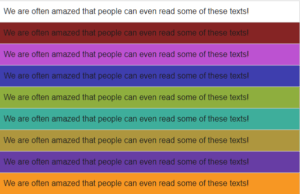
We’ve found the simplest way to do this is to use a block of no-sense text. This prevents the individual’s natural capacity “for predicting what comes next”, to allow repeat scanning of the same subject matter without becoming familiar with its content.
“With the DSO scanning challenge, we are looking at specific data points, and we are looking at the speed of scanning, as this simply points towards gains in accessibility, comfort and ease”.
The gains in accessibility to text on-screen, increase comprehensibility, increase the comfort within your visual system for longer and reduces the risk of early-onset eyestrain, mitigating vision system deterioration.
Until our brains are chipped to interface with our computers directly to the screen, users will still need to use their eyes to read.
Until that day, users contend with screen brightness, glare, colour contrasts, and moving images, all of which can overexcite the visual system and cause fatigue, which leads to all the symptoms of screen fatigue/computer vision syndrome.
We aim to calm the visual system more than aid in dyslexia/comprehension by bringing on board the cones to help the eyes to focus and refocus, not leaving the poor rods to do all the heavy lifting.
That it helps in these areas too is a bonus.
In optometry terms, we aim to increase binocular stability, as we all know looking at a screen for too long causes binocular instability, essentially visual fatigue.
(Anecdotally, we notice an average 20% gain in accessibility/reduction in eyestrain and risk of screen fatigue / CVS by using the DSO, which is being investigated further in our clinical trials.)
What about biometrics?
We currently use AI to drive the DSO, and soon we will be adding biometrics screening and voice recognition to next-generation packages of Score My Screen.
 Text
Text 


